There are some misconceptions in the utility industry regarding bill design. Many still operate from mainframe systems, and they believe that it’s a barrier to updating or modernizing utility bill design. It’s time to clear up this erroneous idea. As partners to the utility industry, we have the technology and expertise to help you reimagine billing, even with older operating systems.
Mainframes Are Foundational for Utility Companies
As an operating system, for many mainframes play a pivotal role in operations for the utility sector. Until the mid-1990s, mainframes were the only option for data processing. That included payroll, general ledgers, and invoicing.
Utilities and other industries use mainframes because they are reliable, scalable, and stable. That’s why they use them to host such mission-critical applications. Mainframes continue to evolve and retain the traits that embody consistency. It’s also highly secure, which is critical when dealing with customer and financial information.
When most people think of mainframes, they think of the “green screen” terminal, but the interfaces now look similar to any applications used on computers. They are often the brains behind the most critical processes of transactions, resource access, database management, and large bandwidth communication.
While mainframes are vital to the utility business, they do have limitations. For those that use their mainframe system to produce invoices, there’s little room to improve on these. Beyond basic information, there’s no way to update the look or add dynamic details. However, you aren’t without options. With the right mail and print partner, mainframes don’t have to hinder the design of utility bills.
Utility Bill Design: Beyond the Mainframe
Modernizing your utility bill design can deliver many benefits, but you likely haven’t thought of those. It’s hard to imagine what’s possible if you believe you’re stuck in a situation. First, let’s talk about the process of going from mainframe to four-color dynamic printing. It starts with advanced technology that allows print and mail providers to manage your templates. You simply send the data securely in files.
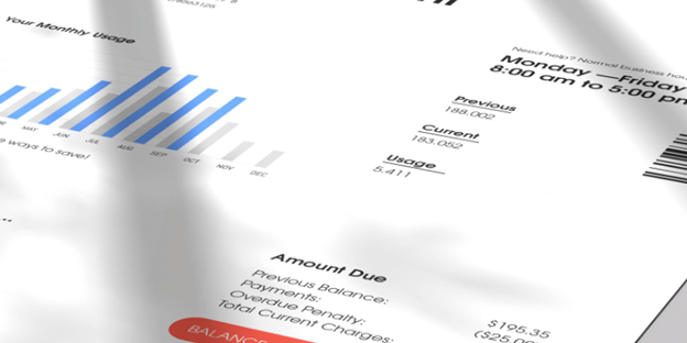
With the template in place, which can include bright, vibrant design, the data from your files fills the pages, including customer, account, and fees information. The formatting can change, making the bill easier to read and understand, which your customers will appreciate. Instead of just text, you can also insert charts that show usage over time.
But there’s more. Along with restructuring and revising the pertinent information, you can also include dynamic messages. Those can change based on the customer. The data in the file addresses which content to print. That could include:
- Energy-efficiency program promotion
- Information on solar panels
- Watering schedules for cities that have restrictions.
- Scam alerts.
- Other services you offer that customers don’t currently purchase.
- Announcements on rate changes or other important information.
These integrated marketing messages and precise ways to present information can positively impact your customer relationships. You may receive payments faster because bills are easier to understand. Customers may be more likely to sign-up for services or promotions. Further, you may have fewer residents breaking usage restrictions.
 Considerations in Redesigning Your Utility Bill
Now that you know you have the freedom to change the bill’s design, what are some best practices?
- Include the customer’s perspective in the process: You can do this in several ways. If you have a good grasp of a customer persona, start with this. However, it’s not a bad idea to ask for feedback. You can do this on your website, via email, or on social channels. Listen to what customers say they want. Make understanding the bill and any actions receivers need to take easy and simple.
- Create hierarchies of information: When we read anything, we appreciate it when it has visual cues of hierarchy and importance. Using headers, subheaders, and other formatting draws attention to the most vital aspects of the bill. Primary messaging would include consumption, amount due, and due date. Secondary information would be charts, announcements, and marketing messages.
- Use color and white space: A four-color invoice looks sharp and professional. It will immediately elevate the experience of customers. White space is crucial, too, as it simplifies the layout and enhances readability. It’s hard to read documents with tight text too close together. Spread things out and use your brand colors throughout.
Ready to Modernize Your Utility Bill Design?
Now that you know mainframes don’t need to hold you back and all we need is your data, it’s time to create a utility bill design that serves your customers and reflects positively on your organization. Get in touch with our utility invoice specialists today to learn more.

